JOFFRE

The Joffre project in the Brentwood area of Los Angeles, CA, is a renovation of the interior and redesign of the rear yard.  The home’s structure and design was classic mid-century, but lacked modern amenities and considerations for the way we live today.

Originally designed by Rodney Walker and built in 1947, the home was later the personal residence of legendary mid-century modernist architect A. Quincy Jones.  Jones, along with Walker, was one of the famed Case Study House Program architects.


Mid-Century Renovation in Brentwood

When working in an historic home, the rooms sometimes aren’t very large. This is typical of in-town, mid-century moderns in the Bretnwood area. Original mid-century architectural details are highlighted and embraced in this renovation. In the living room, we kept the brick fireplace as the focal point of the room. The original clerestory windows on the front elevation are the perfect frame for floating shelves for much needed storage and display space, as well as a media center. Painted doors may have been a design feature in a mid-century modern, but in a modern take on this design style, orange doors punctuate the space and bring a fun, bright accent to the calming tones of the room’s interior design.  Wood clad ceilings with exposed beams are another original detail of the home.  The ceilings are painted white throughout, which unifies the space and brings texture to the design.

Structural changes to modernize the space include opening the wall to the kitchen and expanding the original footprint.  This was essential to improving the function of the space and the flow between the rooms.  Without the walls, the space feels larger.  Determined to improve the original compact workspace, we extended a peninsula into the den and pushed the cabinetry down to match. This created a wall of pantry storage and plenty of drawers in the island for all the kitchen gadgets of modern living. Around the hood vent, we installed floating wood shelves stained in a natural tone, which brings an earthy vibe so reticent of our brand of California Modernism design.

The home’s bedrooms were refreshed and the bathrooms were completed gutted and replaced. The same black, hex tile on the floor and white subway tile on the walls was used in both main bathrooms. The black on the floor grounds the visual boundaries of the room, which makes it feel larger. We positioned alcoves in the gaps of the wall studs for increased storage in the shower, as well as above the water closet, and adjacent the free standing tub. Rich, natural wood tones in both the vanities and accessories make the spaces feel warm, luxurious, and inviting.

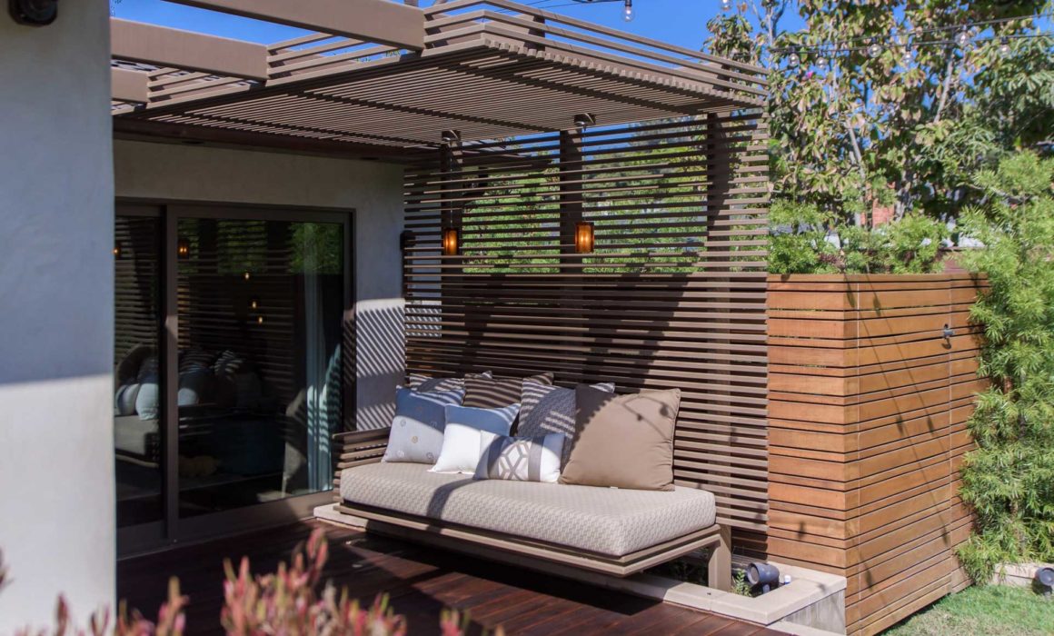
In the first phase of this renovation project, we started with transforming the exterior spaces. Long an overlooked space, it was our goal to create a relaxing rear yard area in a very limited space of only 24’ x 50’. Our solution was to organize various zones for gathering and activity within a larger coordinated open area. This allowed the overall area to feel more spacious but also created semi-private spaces. A mangaris wood deck extends from the Master Bedroom suite for sun bathing and lounging prior to taking a dip in the Jacuzzi. In addition, there is a hammock area that is situated on the western side of the property to take advantage of the shade from the adjacent tree. Along a concrete paver path on crushed rock, there is a sitting area for casual conversation and a glass of wine. There was also the need to screen the views from a two story apartment complex that overlooks the corner of the property. To do this, we took cues from the slatted wood ceiling of the home’s living room to create a steel trellis; painted to evoke the feeling of wood but with far greater durability and strength. Along with the trellis ceiling, the olive tree screens the neighbor’s view of those sitting around the firepit on the cantilevering cushioned seats and day bed.

When we returned to do phase two of this project to renovate the interior of the home, we were delighted to see that the evergreens we had planted were all maturing nicely and creating the private oasis we’d envisioned for the outdoor space.

ARCHITECT: KRUEGER ARCHITECTS
CONSTRUCTION: DESIGN-BUILD
PHOTOGRAPHY: UNLIMITED STYLE PHOTOGRAPHY

“The goal for renovating this mid-century home was to maximize the space and, where possible, to give the appearance of more room.”

-Kurt Krueger

From the Blog

California Architect, Kurt Krueger featured on Houzz
Privacy Settings
We use cookies to enhance your experience while using our website. If you are using our Services via a browser you can restrict, block or remove cookies through your web browser settings. We also use content and scripts from third parties that may use tracking technologies. You can selectively provide your consent below to allow such third party embeds. For complete information about the cookies we use, data we collect and how we process them, please check our Privacy Policy
Youtube
Consent to display content from - Youtube
Vimeo
Consent to display content from - Vimeo
Google Maps
Consent to display content from - Google