PALACE SKATEBOARDS

Palace Skateboards, an extremely successful streetwear company with a limited edition and ever changing product line, is the kind of company that is always up for a new and unconventional approach to retail. They wanted Krueger Architects design-build team to pursue their mantra of moving away from the expected with the design of their second retail store in the U.S. The direction was ancient Roman juxtaposed with LA Punk! The new store located in Los Angeles launched shortly after their flagship U.S. store debuted in Soho with a “Versace 80’s” vibe.

Entrance

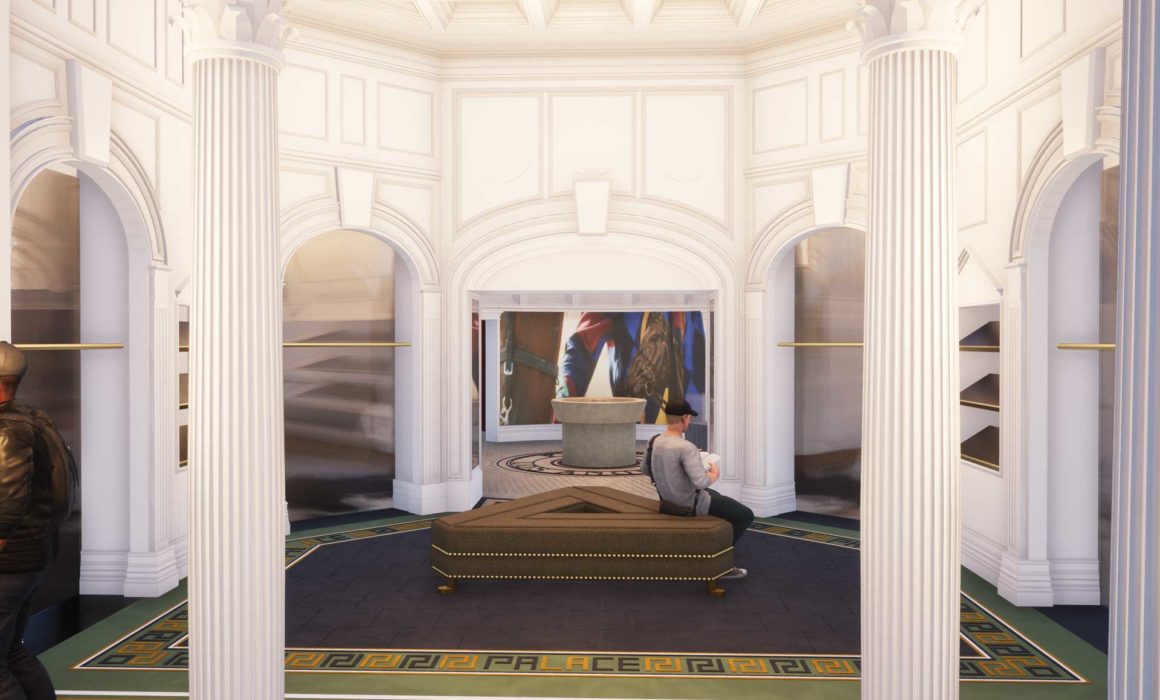
The pink awning with custom white fringe detail (an absolute must for one of the company’s partners) shows the customer to the door. Door handles fabricated in the shape of the letter ‘P’ in Palace, open the double doors.  Inside you proceed under the cover of a Roman-style temple. Six pillars support the structure, which reveals itself as a temple as you enter further into the gallery space of the store.

Gallery

On the right is a gallery wall to display Palace’s skateboards. Encircling the rest of the space are racks to display the latest “drop” of garments. The garment displays are arched alcoves inspired by Romanesque architecture. They are backed with mirrors that visually expand the space by bounce light throughout. Clothing is displayed in the store to show colors and styles with the full inventory of the stock in a backroom. This allows the clothing to be easily discovered and selected. We were determined to move away from the clutter of freestanding racks and the trendy “pop up” like stores.

Two hand carved water features with faces as the fountains hang from the walls. Custom tile mosaics in a symmetrical layout are used on the flooring to help create sections within the large open space.

Point of Sale

Transitioning from the gallery space to the point of sale area, the volume of the space expands as you are now under a recreation of the famous Pantheon Dome–complete with oculus. Although the opening at Palace is a skylight that brings in only light, not rain like the open oculus of the Pantheon. The dome was molded and created in New York by Atta studios with strict seismic framing and allowances. The dome was shipped in thirteen 400 lb pieces to be hoisted into position below the skylight.

At the center of the point of sale space is a 2,000 lb fountain meant to be in the shape of a sundial. The stone fountain contains a video projector. The carved stone cap is the perfect size to conceal the projector. A constant loop of Palaces award winning videos displays on the 13′ x 7′ curved seamless screen on the back wall of the store. For the LA store we introduced Palace to video mapping. which is the icing on the dome! The dome had to be perfectly modeled and installed for the mapping to be calibrated and display properly. Lighting, sound and HVAC were tucked above and behind moldings and a complete facade was built to remind all of the company’s British heritage.

ARCHITECT: KRUEGER ARCHITECTS
LEAD DESIGNER: F2 ARCHITECTURE, PLLC
CONSTRUCTION: DESIGN-BUILD
PHOTOGRAPHY: UNLIMITED STYLE PHOTOGRAPHY

Each retail locations has three distinct areas: entrance, gallery, and point of sale.

From the Blog

Privacy Settings
We use cookies to enhance your experience while using our website. If you are using our Services via a browser you can restrict, block or remove cookies through your web browser settings. We also use content and scripts from third parties that may use tracking technologies. You can selectively provide your consent below to allow such third party embeds. For complete information about the cookies we use, data we collect and how we process them, please check our Privacy Policy
Youtube
Consent to display content from - Youtube
Vimeo
Consent to display content from - Vimeo
Google Maps
Consent to display content from - Google